Accessing and Visualizing the CP1919 Pulsar Dataset in R
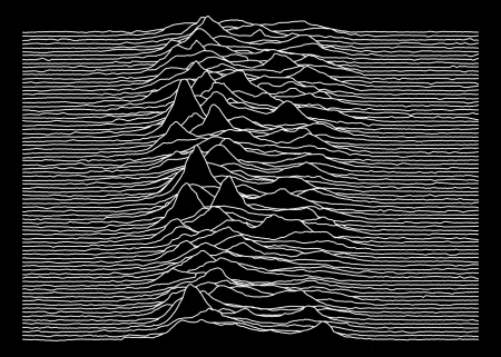
Recently, the CP1919 pulsar dataset, long associated with the iconic Joy Division album cover, has gained renewed interest among R users and data enthusiasts. Originally recorded from one of the first discovered pulsars, its accessibility just got a lot easier thanks to the release of the cp1919 package on CRAN. This dataset, which captures the pulsar's radio emissions occurring every 1.337 seconds, offers a fascinating intersection of music and astronomy.
The Significance of the CP1919 Dataset
This dataset consists of vertical overlays of the successively recorded pulses from CP 1919, shedding light on the behavior of rapidly spinning neutron stars. Pulsars, like CP 1919, are highly magnetized, rotating neutron stars that emit beams of electromagnetic radiation. As these beams sweep across Earth, they create regular pulses detectable by radio telescopes. For anyone diving into astrophysics or even data analysis within a scientific context, understanding such phenomena becomes fundamental.
Those familiar with the original plot from Craft's landmark 1970 dissertation, "Radio Observations of the Pulse Profiles and Dispersion Measures of Twelve Pulsars," will recognize it as an instrumental part of pulsar studies. This dataset represents more than just numbers; it serves as a historical artifact, highlighting both the advancements in astrophysics and the unique cultural crossover with music. When music and science converge, they offer an unconventional yet rich tapestry for exploration.
Making Data Accessible
Here's the thing: making this dataset more accessible simplifies the data visualization process while encouraging creativity in R. The release of the cp1919 package signifies an important development for R users, especially those in data science. Those once hindered by complex access protocols can now focus on the data itself rather than being bogged down by technical challenges. I organized the dataset, documenting all aspects to clarify its columns, ensuring users can focus on analysis rather than confusion. This documentation is vital; clarity in data handling can often distinguish between a meaningful insight and an overlooked observation.
Installation of the Package
To begin your journey with the dataset, you can easily install the cp1919 package directly from CRAN:
install.packages("cp1919")
Alternatively, for the latest features, you can opt to install the package from GitHub:
pak::pkg_install("pachadotdev/cp1919")
Installing packages from GitHub is a common practice among R users who want cutting-edge functionalities that aren't yet available in stable CRAN versions. This flexibility ensures that users have access to evolving tools as the community continues to innovate.
Reading the Dataset
After installation, loading and inspecting the data is straightforward. Use the following commands to load the pulsar data:
library(cp1919)
head(pulsar)
measurement time radio_intensity
1 1 1 -0.81
2 1 2 -0.91
3 1 3 -1.09
4 1 4 -1.00
5 1 5 -0.59
6 1 6 -0.82
Here, you can see the structure of the dataset at a glance. It gives you an immediate sense of the various metrics, such as measurement, time, and radio intensity. Understanding these metrics is key for any further analysis you intend to undertake.
Visualizing Pulsar Data
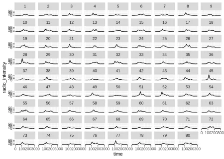
Your initial visualization might not resemble the familiar Joy Division album art, but it’s an essential starting point. Visualization is often where data stories come to life. Use ggplot2 for a basic line plot:
library(ggplot2)
ggplot(pulsar) +
geom_line(aes(x = time, y = radio_intensity)) +
facet_wrap(~measurement)
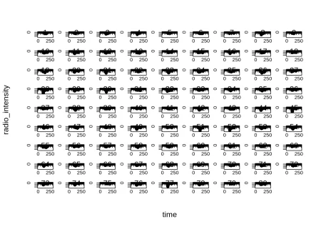
For an alternative approach, you might consider the tinyplot package. This package also provides functional visualizations:
library(tinyplot)
plt(radio_intensity ~ time, data = pulsar, facet = ~measurement)
The choice between these tools speaks volumes about the R community: it’s diverse and collaborative, resulting in various methods for tackling similar tasks.
Creating Stacked Wave Plots
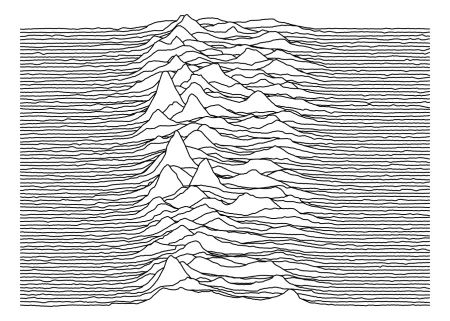
To develop a plot that layers the pulsar waves similar to the iconic album design, turn to the ggridges package:
library(ggridges)
col1 <- "white"
col2 <- "black"
ggplot(pulsar, aes(x = time, y = measurement, height = radio_intensity, group = measurement)) +
geom_ridgeline(min_height = min(pulsar$radio_intensity), scale = 0.2, linewidth = 0.5, fill = col1, colour = col2) +
scale_y_reverse() +
theme_void() +
theme(panel.background = element_rect(fill = col1), plot.background = element_rect(fill = col1, color = col1))
For a more traditional base R style, you can manipulate the data further using foundational plotting methods:
pulsar2 <- transform(pulsar, measurement = factor(measurement))
measurements <- sort(unique(pulsar2$measurement))
n <- length(measurements)
scale_fac <- 0.2
pulsar2$y_stacked <- scale_fac * pulsar2$radio_intensity + (n - match(pulsar2$measurement, measurements))
par(bg = col1, mar = c(0, 0, 0, 0))
plt(y_stacked ~ time | measurement, data = pulsar2, type = type_area(alpha = 1), ylim = range(pulsar2$y_stacked), bg = col1, col = col2, axes = FALSE, legend = FALSE, frame.plot = FALSE)
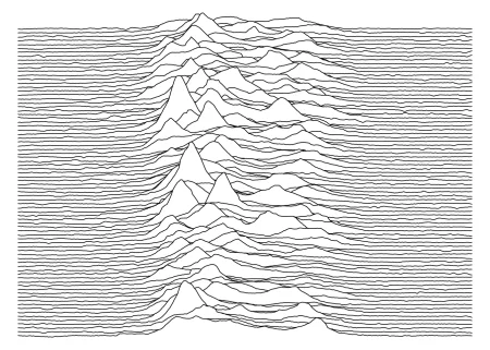
The final visualization, much like the Joy Division cover, isn't just aesthetically pleasing but a fitting tribute to both music and astronomy:
col1 <- "black"
col2 <- "white"
ggplot(pulsar, aes(x = time, y = measurement, height = radio_intensity, group = measurement)) +
geom_ridgeline(min_height = min(pulsar$radio_intensity), scale = 0.2, linewidth = 0.5, fill = col1, colour = col2) +
scale_y_reverse() +
theme_void() +
theme(panel.background = element_rect(fill = col1), plot.background = element_rect(fill = col1, color = col1))
Implications and Future Outlook
As you experiment with the CP1919 dataset, not only do you contribute to its ongoing legacy, but you also unlock new ways to visualize astronomical phenomena through the lens of software like R. This renewed focus on the dataset opens doors for interdisciplinary research. If you're working in this space, you might find opportunities to blend artistic representations with scientific inquiry.
The continued accessibility of such datasets challenges the traditional boundaries between different fields. This notion—where data science meets astrophysics, and even music—could shape future research methodologies. As more researchers aim to interpret complex datasets like CP1919, the implications stretch far beyond mere analysis; they invite creativity and diverse perceptions of data interpretation.
(and this is the part most people overlook) The evolution of tools and packages in R indicates a potential shift in how data is consumed. Users aren’t merely observing data patterns; they’re also engaging with the material culturally and artistically. This integration of multiple disciplines might define the next generation of data exploration.
In essence, the CP1919 dataset is a unique convergence point for time series analysis, artistic expression, and scientific investigation—a trifecta that can inspire new ideas and applications.