Transforming Research Visuals: Efficient Flowchart Creation with Gmisc in R
Enhancing Flowcharts for Research Impact
Flowcharts aren't just a matter of aesthetics; they're pivotal in conveying complex research processes effectively. The evolution of the flowchart component in the Gmisc package stems from understanding the challenges faced by researchers. Based on insightful feedback from experts like Alan Haynes, this upgrade aims to create a practical tool for the types of illustrations researchers repeatedly draft by hand. Instead of yet another decorative diagram generator, this flowchart functionality is tailored to produce CONSORT diagrams, cohort derivation charts, and similar visual tools that articulate a study's methodology succinctly. Consider how the requirements shift when a figure transitions from the brainstorming stage to publication-ready. It’s no longer sufficient for a flowchart to be merely eye-catching. When integrating it into a manuscript, the counts often need adjusting, exclusion criteria must align with analytical scripts, and treatment arms should be clearly outlined. These figures should not become a burden during reviewer iterations; they need to adapt dynamically without requiring tedious manual interventions. Here lies the utility of the `flowchart()` function within Gmisc: it transforms diagrams into integral components of the research workflow, aligning visuals with ongoing analysis. Take a look at this example flowchart, one of the intended outputs from Gmisc: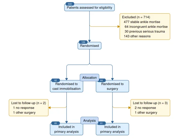 This kind of output provides researchers with a practical solution for crafting graphics that feel natural within a manuscript context. It retains a grid graphic format in R while mimicking manuscript standards. There are grouped arms, side exclusions, badge counts, phase labels, and arrows that won't require constant adjustments after every text modification.
Below each chart in this article, you’ll find the R code used to generate these visuals, emphasizing reproducibility.
```r
library(Gmisc)
library(grid)
```
By wrapping the command in a graphics device call, you can save these figures effortlessly:
```r
png("01-consort-color.png", width = 9, height = 7, units = "in", res = 180, bg = "white")
# ... the flowchart code ...
dev.off()
```
### Flexibility in Research Figures
One of the standout benefits of creating flowcharts in code is not just about elegance; it’s about adaptability. The reality is that research figures are often incomplete until the last stages of analysis.
Take, for instance, a scenario where a new dataset requires recalibrating inclusion counts. Or perhaps a reviewer requests a sensitivity analysis that prompts splitting exclusion categories. If the flowchart is hand-drawn, each of these changes introduces a risk of discrepancies between the figures and the analysis they represent.
In contrast, when flowcharts are generated alongside the analysis code, they remain aligned with the evolving data:
```r
flowchart(...) |>
spread(axis = "y") |>
spread(subelement = "arms", axis = "x") |>
connect("randomised", "arms", type = "N")
```
This approach underscores a straightforward mental model: define the elements, arrange them logically, and connect them appropriately. Polishing the end product is still possible, but the underlying structure remains reproducible and reflective of the latest data inputs.
### Cohort Derivation for Real-World Data
Most clinical researchers do not initiate their studies with a polished flowchart. Instead, they often begin with varied data sources—registry extracts, electronic health records, or even spreadsheets from collaborations.
These complex workflows require equally clear figures.
This kind of output provides researchers with a practical solution for crafting graphics that feel natural within a manuscript context. It retains a grid graphic format in R while mimicking manuscript standards. There are grouped arms, side exclusions, badge counts, phase labels, and arrows that won't require constant adjustments after every text modification.
Below each chart in this article, you’ll find the R code used to generate these visuals, emphasizing reproducibility.
```r
library(Gmisc)
library(grid)
```
By wrapping the command in a graphics device call, you can save these figures effortlessly:
```r
png("01-consort-color.png", width = 9, height = 7, units = "in", res = 180, bg = "white")
# ... the flowchart code ...
dev.off()
```
### Flexibility in Research Figures
One of the standout benefits of creating flowcharts in code is not just about elegance; it’s about adaptability. The reality is that research figures are often incomplete until the last stages of analysis.
Take, for instance, a scenario where a new dataset requires recalibrating inclusion counts. Or perhaps a reviewer requests a sensitivity analysis that prompts splitting exclusion categories. If the flowchart is hand-drawn, each of these changes introduces a risk of discrepancies between the figures and the analysis they represent.
In contrast, when flowcharts are generated alongside the analysis code, they remain aligned with the evolving data:
```r
flowchart(...) |>
spread(axis = "y") |>
spread(subelement = "arms", axis = "x") |>
connect("randomised", "arms", type = "N")
```
This approach underscores a straightforward mental model: define the elements, arrange them logically, and connect them appropriately. Polishing the end product is still possible, but the underlying structure remains reproducible and reflective of the latest data inputs.
### Cohort Derivation for Real-World Data
Most clinical researchers do not initiate their studies with a polished flowchart. Instead, they often begin with varied data sources—registry extracts, electronic health records, or even spreadsheets from collaborations.
These complex workflows require equally clear figures.
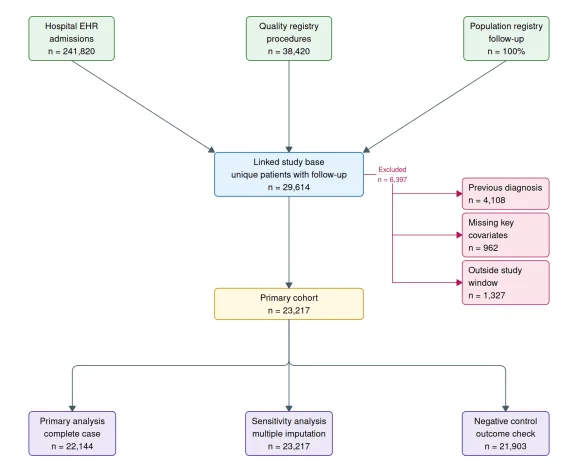 An effective flowchart not only illustrates who was included in the study but also articulates how this population was constructed—highlighting linked data sources, points of exclusion, and the eventual analytic cohorts.
For observational studies, where tables can merely report characters at baseline, a well-crafted flowchart explains how the cohort was derived. It effectively answers the critical question: “What transformations occurred between original data and analytical models?”
By incorporating these elements, Gmisc fosters a more accurate and efficient visualization process, enhancing both clarity and utility in research presentations.
An effective flowchart not only illustrates who was included in the study but also articulates how this population was constructed—highlighting linked data sources, points of exclusion, and the eventual analytic cohorts.
For observational studies, where tables can merely report characters at baseline, a well-crafted flowchart explains how the cohort was derived. It effectively answers the critical question: “What transformations occurred between original data and analytical models?”
By incorporating these elements, Gmisc fosters a more accurate and efficient visualization process, enhancing both clarity and utility in research presentations.Why Flowcharts Matter
Flowcharts aren't just decorative elements in research papers; they play a vital role in clarifying complex processes in medical statistics. The integration of flowchart functionality in Gmisc is a nod to the practical realities faced by researchers. While they don’t replace statistical models, they enhance how findings are communicated, ensuring that the statistical narrative is as clear as the data itself.
The latest updates in Gmisc's 3.4.0 release reflect a concerted effort to address everyday challenges researchers encounter. Consider these enhancements:
- Streamlined creation of CONSORT diagrams to ease the drawing process.
- Maintaining consistent, aligned group stages for better readability.
- Predictable arrow behaviors that facilitate understanding.
- Support for side paths and return routes, creating more flexibility in diagram design.
- The ability to easily regenerate figures as the study evolves, keeping everything up-to-date.
If you're actively involved in medical research, you'll recognize the importance of flowcharts when visualizing trial enrollment, registry design, and follow-up procedures. The goal here isn't merely to provide a cute plotting tool; it's about embedding flowcharts directly into the analytic fabric of research. This ties the visual representation closely to the underlying data, making it an extension of your analysis process.
For those looking to dive deeper, the full API and plenty of illustrative examples can be found in the vignette:
vignette("Grid-based_flowcharts", package = "Gmisc")
R-bloggers.com provides daily e-mail updates on R news and tutorials for learning R and a variety of other topics. Click here if you’re looking to post or find an R/data-science job.
Interested in sharing your work on R-bloggers? Click here if you have a blog, or here if you don’t.