Google Messages Tests a Roomier Pinned Chats Layout and New Search Button
A new home for pinned conversations
Google Messages is testing a home screen that gives pinned conversations more visual space and changes where users find search. The redesign makes favorite chats easier to spot, but it may add friction for people who rely on a compact list to reach recent conversations quickly. That’s the basic tension: the interface gives a small set of conversations more prominence while leaving less room for the rest.
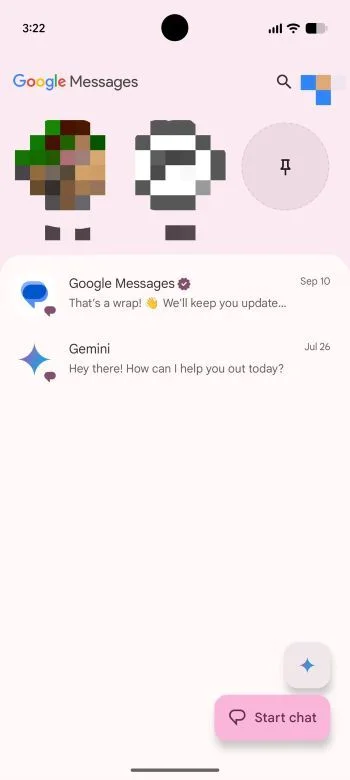
Beta users began reporting the changes on Reddit. In the current design described by testers, pinned chats appear as smaller entries with large contact photos; the experimental layout instead gives them a dedicated area above the regular message list. That makes the distinction between pinned and unpinned threads clearer at a glance. It also changes the home screen’s hierarchy: pinned chats become a prominent destination, while recent conversations start farther down.
The more spacious presentation recalls Apple’s iMessage. The resemblance is visual, based on the way the pinned area is set apart from the rest of the list; it doesn’t establish that Google is copying the underlying design or behavior. Still, familiarity can be a useful shortcut for users moving between messaging apps. The practical cost is equally plain: larger pinned items push unpinned conversations lower and can mean more scrolling. This is more significant than it looks for people who open Messages to resume whichever conversation arrived most recently.
A visual upgrade with a space tradeoff
Early reactions are split, which is unsurprising for a change that affects the first screen people see. Some Reddit users say the larger pinned chats are easier to recognize and improve the app’s appearance. Others find the iOS-like arrangement crowded at the top. Those responses point to different habits: someone who regularly returns to a few important threads may welcome the emphasis, while someone who treats the inbox as a running list may find the added block gets in the way.
One tester also noticed an empty placeholder when only a few chats are pinned. According to the original poster, adding more pins eventually fills the space, though that account doesn’t establish how the interface behaves for every user. The same user speculated that the limit could be six conversations. That remains a tester’s guess, not a confirmed limit from Google.
Search is shifting, too. In the experimental layout, it moves from its usual spot to a floating button beside “Start chat.” The control changes with the page’s scroll position, appearing as either a round magnifying glass or a pill-shaped search button. That makes the search control’s appearance depend on where the user is in the list, a small interface detail with a practical purpose: keeping search available without reserving the same amount of space at every scroll position.
Google hasn’t clarified where the Gemini shortcut will sit in this arrangement. That leaves an open question about how the redesigned home screen will accommodate the app’s other entry points. The available reports describe the search control and pinned area, but don’t establish what the final layout will include or how those controls will be prioritized.
New UI Design?from r/GoogleMessages
Testing remains limited and uneven
The redesign is reaching some users on Google Messages beta version 20261030_00_RC00, while others on the same beta haven’t seen it. A Reddit poster reported receiving the interface on a Pixel 9 Pro without another Play Store update, pointing to a rollout controlled through Google’s servers. That pattern is consistent with a server-side rollout, where access to an interface can change independently of an app update. It also means the beta version number alone doesn’t tell users whether they’ll see the redesign.
Testers have also reported choppy animations and variations in which interface changes appear. Those reports make it difficult to treat the current experience as a settled preview of the final design. Early builds can expose usability problems that aren’t apparent in static screenshots, and different combinations of changes can make feedback harder to compare. Here’s the thing: the layout’s success will depend on how it feels during ordinary use, not just on whether the pinned section looks cleaner in an image.
Google hasn’t announced when the design might reach the stable release, so the current experience could still change. The company may adjust the spacing, animations, or placement of controls as testing continues, but the reports don’t confirm which changes, if any, are planned. For now, testers are describing an experiment rather than a finished redesign.
What the redesign could mean for everyday use
The central design question is whether pinned chats should gain prominence at the cost of space for recent messages. Pinning already signals that a conversation matters to the user; a larger dedicated area makes that choice more visible, but it can also make the inbox less efficient for people who don’t use pins. If you’re working in this space, the useful measure is whether the new hierarchy saves time for one group without slowing down another.
A compact option alongside the expanded view would let people choose between visual emphasis and quicker access. That would address the competing preferences in the early reactions, although the reports don’t indicate whether Google is considering such a control. There’s a tradeoff in offering more choices, too: another setting can help people tailor the app, but it can make an interface harder to understand if its purpose isn’t clear.
(And this is the part most people overlook.) A home screen isn’t merely a place to display conversations; it shapes which conversations feel easiest to return to. More space for pinned chats could be useful for people who intentionally organize their messaging, while the same space could feel like an obstacle to people who navigate by recency. A cleaner presentation for one pattern of use. A longer route for another.
For now, the beta suggests Google is still working out that balance. The redesign’s strongest case is that favorite conversations become easier to recognize; its clearest cost is that other threads move down. Whether the change feels like an improvement will depend less on the visual similarity to another app than on how much scrolling users are willing to accept.